Strategy One
Embed a Navigation Panel in a Dashboard
Beginning in Strategy One (May 2026), you can quickly and easily embed a navigable table of contents into your dashboard. The navigation panel lists each chapter and page in the dashboard so users can easily view the dashboard's structure and navigate through it. The navigation panel automatically displays on every page of the dashboard. Use the navigation panel to replace navigation bars that you manually create and maintain.
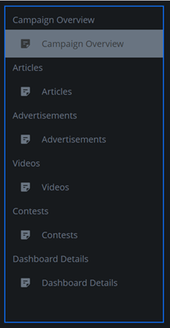
This dashboard displays a navigation pane positioned on the left.
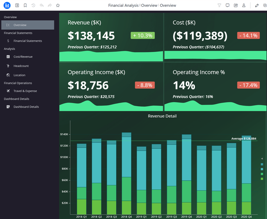
The navigation pane automatically displays on all pages of the dashboard.
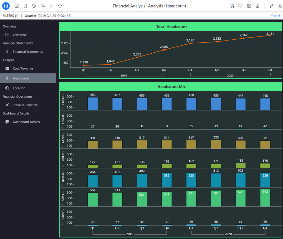
If you add or remove a page or chapter, the navigation panel automatically updates.
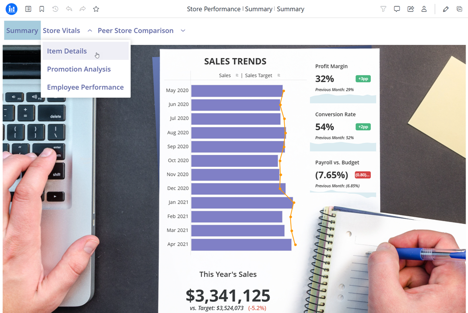
You can display the content in the panel as a flat list, as shown above, or as a drop-down list, as shown below. For the drop-down list, you hover your cursor over a chapter displayed in the panel to view the chapter's pages. You can also display it on any side of the dashboard page. The examples above display it on the left, while the example below shows it on the top.
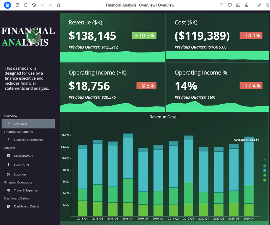
The navigation panel acts like a regular panel, so you can add other objects to it. In the dashboard below, an image and a text box display in the same navigation panel as the navigation content.
To further simplify the interface and allow the navigation panel to serve as the only navigation method, you can hide the Table of Contents icon in the toolbar.
Embed a Navigation Panel
- Edit a dashboard.
- In the Library window, right-click the dashboard and select Edit.
-
In the toolbar, click the Show Navigation icon
 .
.The navigation panel is added to the left side of the page, taking up the full length of the page. The pages and chapters display in a flat list.
Use the Navigation Panel in Editing Mode
-
You can use the navigation panel to move to a different page. Use the Contents panel to change the cover image and manage pages and chapters.
-
You can hide the navigation panel to focus on the rest of the page's layout, and then display it again.
Add Objects to the Navigation Panel
-
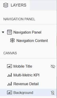
The navigation panel acts like a regular panel, so you can add objects to it. In the Layers panel, select Navigation Panel and then add text, rich text, an image, an HTML container, or a shape.
Format the Navigation Content
You format the content on the panel separately from the panel itself. The content is the actual table of contents entries. The steps below are an overview of the available formatting options. For details, see Format Panel for Navigation Panel Content.
-
In the Layers panel, the Navigation Panel and the Navigation Content are shown as two separate objects. Right-click Navigation Content and select Format.
-
Alternatively, right-click the table of contents in the navigation panel and select Format.
-
-
Use the Navigation Options tab
 of the Format panel to:
-
Align the content
-
For pages, determine whether to display text or both icon and text, select a different icon for each page, and define the size and button shape for pages
-
For chapters, determine whether to display the chapters; select a flat list or drop-down list; determine whether to display text, icon, or both; select a different icon for each page; and define the size and button shape for chapters
-
-
Use the Text and Form tab
 of the Format panel to format the text of the:
-
Entire Component to set default text options for all the text
-
Page Selections to format the font and background fill of page names and of the selected page name, independently of the entire component
-
Chapter Selections to format the font and background fill of chapter names and of the selected chapter name, independently of the entire component
-
-
Use the Title and Container tab
 of the Format panel to format the container which holds the Navigation content. You can select the background fill, border and radius, padding, and more.
 -
In the Layers panel, right-click Navigation Panel and select Format.
-
To define the panel's layout, click the Navigation Panel Options icon
. -
In Layout Mode, click either Convert to Free-form Layout or Convert to Automatic Layout. This applies to the navigation panel only, not the dashboard page.
-
Use free-form layout to organize and overlap the visualizations, filters, selectors, images, HTML, and other objects. You can independently position, size, and layer containers on the panel.
-
Use auto layout to automatically fill the panel's screen area with the objects. The objects can be repositioned around each other.
-
-
If you selected free-form layout, choose whether to Stretch the Elements to fill the panel or Expand the Canvas to add more content to the panel without resizing the existing canvas.
-
If you selected auto layout, adjust the Padding.
-
Enable or disable Vertical Scrolling. When enabled, a scroll bar displays when the dashboard is viewed on screens at a lower resolution.
-
If you enabled vertical scrolling, set the Minimum Height.
-
-
Specify the Width of the navigation panel.
-
From the Layout drop-down list, select the location of the navigation panel: Left, Top, Right, or Bottom.
If you select Top or Bottom, the chapters are locked as drop-down lists rather than flat lists.
-
To format the panel container, click the Title and Container icon
 .
. - Select the Fill color and its transparency.
- Select a Border style and color.
-
Adjust the Radius of rounded corners for the panel container.
-
Use a number between 0 and 40.
-
If the current Padding is less than 50% of the updated Radius, Padding automatically increases to match 50% of the new Radius.
-
- Adjust the Padding around the panel container. Use a number between 1 and 100.
-
Apply a Shadow effect on the container. Select the fill color and opacity of the shadow. Define the shadow effects using the following options:
-
Blur: Controls the softness of the edge to diffuse or spread out the shadow. The range is from 0 to 40, where 0 is a sharply defined line and 40 is the most blurred.
-
Distance: Offsets the shadow from the container. Distance provides a 3D look, implying hierarchy or focus.
-
Angle: Sets the direction of the shadow around the container, measured in degrees. For example, to display the shadow:
-
Directly on the right, use 0.
-
On the bottom and right, use 45.
-
Below the container, use 90.
-
On the top, use 270.
-
-
-
To further simplify the interface and allow the navigation panel to serve as the only navigation method, you can choose to hide the Table of Contents icon in the toolbar when the dashboard is viewed:
-
From the File menu, select Dashboard Properties.
-
In the list on the left, click Consumption View.
-
From the Table of Contents Panel drop-down list, select Hide the Panel and the Entry.
-
Click OK.
-
-
Save the dashboard.
Hide the Navigation Panel
Hiding the panel does not delete panel, it only temporarily removes it from view. When you display it again, all your formatting and configuration remains.
- Edit a dashboard.
- In the Library window, right-click the dashboard and select Edit.
-
In the toolbar, click the Hide Navigation icon
 .
. If you hid the Table of Contents icon in the toolbar, be sure to re-display it so viewers can navigate the dashboard.
-
Save the dashboard.
Delete the Navigation Panel
When you delete the panel, it is permanently removed from the dashboard. This includes any objects beyond the navigation content that you added to the panel.
- Edit a dashboard.
- In the Library window, right-click the dashboard and select Edit.
-
In the Layers panel, right-click Navigation Panel and select Delete.
If you hid the Table of Contents icon in the toolbar, be sure to re-display it so viewers can navigate the dashboard.
-
Save the dashboard.