
Format Panel for Gantt Chart Visualizations
Once you add a Gantt chart visualization to a dashboard, you can format it.
Access the Format Panel
- Edit an existing dashboard that contains a Gantt chart visualization.
Right-click the dashboard and select Edit.
- Select the visualization.
-
The Editor, Filter, and Format panels are stacked together by default. Click Format
 to open it.
-
If the Format panel is not available, do one of the following:
-
Starting in Strategy One (November 2025), click the Format icon
in the left toolbar. -
Prior to Strategy One (November 2025), from the View menu, select Editor Panel to display all three panels. Click Format
to open it.
-
-
Starting in Strategy One (November 2025), you can place the Editor, Filter, and Format panels above and below each other as though in a column. To do this, drag one panel to the bottom of another. You can then adjust the relative height of the panels by hovering your cursor over the line dividing the panels and dragging the resizing icon up or down.
-
-
Select one of the following tabs on the Format panel:
-
Visualization Options
 to format the high-level layout and appearance
 -
Text and Form
 to customize the fonts and forms displayed in various areas on the visualization
 -
Container
 to format the visualization’s title and container
-
Visualization Options
Template
-
Choose how to color the visualization: by the objects in the Project Hierarchy, Label, or Status drop zones.
-
Customize the color palette.
Sort Define the initial sort. End users can then sort the chart while viewing it. They can sort by any object in the vertical or horizontal axis.
-
Select the drop zone to Sort By.
-
Select the Direction of the sort: Ascending (A to Z, earliest date to latest) or Descending (Z to A, latest date to earliest).
-
By default, each attribute is sorted within its parent attribute (such as tasks being sorted within each category). You can sort all the attribute elements in one list by clearing the Sort Siblings Within Hierarchy check box.
Initial View
-
Select when the timeline begins when the chart is initially opened. For example, if you select Earliest Task, the timeline begins at the earliest task. The options are:
-
Earliest Task
-
Today
-
Latest Task
-
First Reference Line: A reference line is a vertical line displayed on the timeline to represent a specific date, such as a milestone or major deadline.
-
Custom Date: Type the date in mm/dd/yyyy format or click the calendar icon to select the date
-
-
Choose the Padding around the top and bottom of the rows.
-
By default, the bar height is set automatically, but you can change the Marker Size from Automatic to Manual and then set the height. A smaller height condenses the view.
-
Select the Tile Radius in pixels of the rounded corners for the bars. A larger radius provides a more rounded shape.
-
By default, the rows are banded, but you can clear the Enable Bandings check box.
-
Use the Show Tasks Without End Date as Open-Ended check box to:
-
Display these tasks as an open-ended bar by selecting the check box.

-
Display these tasks as a bar with the text No time range defined by clearing the check box.

-
Zoom You can configure the date scale of the timeline. If you disable Zoom, the zoom selector does not display and the configuration settings are not available.
-
From the Set Zoom Level drop-down list, select the scale for the initial display of the timeline, such as Days or Quarters, or leave it at Auto.
-
By default, end users can change the date zoom. To keep users from changing it, clear the Show Zoom Controls check box.
-
For Hours and Days zoom levels, by default, weekends display on the timeline but are grayed out.
-
To display working days only, clear the Display Weekends check box.
-
To display the weekends as regular days, not grayed out, clear the Outline Weekends check box.
-
-
For the Hours zoom level, you can set the Working Hours to display, using a 24-hour clock.
-
For the Days zoom level, you can determine whether to Show Month on Day Labels.
-
The Zoom settings do not change the vertical axis or bar height. To change them, adjust the Padding and Marker Size in the Layout section.
Data Labels Configure the label to display on the chart's bars. If you disable Data Labels, the bars do not display any text and the settings are not available.
-
By default, the lowest level attribute in the Project Hierarchy drop zone displays on the bars. Use the Value drop-down list to display:
-
The attribute in the Label drop zone by selecting Label
-
The attribute in the Start Date drop zone by selecting Start Date
-
The attribute in the End Date drop zone by selecting End Date
-
Percent Complete
-
The lowest level attribute in the Project Hierarchy drop zone by selecting Task
-
-
Select the label Position relative to the bar:
-
Inside then Outside: Inside the bar unless the label does not fit fully, then outside (default)
-
Inside Left: Inside the bar and left-aligned
-
Inside Right: Inside the bar and right-aligned
-
Outside End: Outside the bar at the end
-
-
Show Labels for Every Window Shows a label on each block in a row. Used for multiple occurrences, such as room bookings, as shown below.

To hide the horizontal axis, which displays the timeline dates or duration:
-
From the Axis Type drop-down list, select Horizontal.
-
Disable Axis Labels.
To format the horizontal axis:
-
From the Axis Type drop-down list, select Horizontal.
-
Select the display Position of the axis: Top or Bottom of the chart.
-
Determine whether to Show Rulers, which display as small lines in the axis, as shown below the dates in the example below.

-
Select whether to Wrap Text on the horizontal axis.
-
The axis text is automatically rotated to fit the page size. You can manually select the Rotation, where 0 is horizontal and 90 is vertical.
-
You can enable a Second Axis to display an additional level of time.
For steps and an example, click here.-
Select the display Position of the axis: Top or Bottom of the chart.
-
Select one of the following:
-
To allow the scale to change dynamically based on the zoom, select From Data.
-
To show a fixed ordinal scale, such as Month 1 or Quarter 2, select Ordinal.
-
Select the Unit of date, such as Day or Month to display.
-
-
To hide the vertical axis, which is the columns on the left including the Project Hierarchy and Column:
-
From the Axis Type drop-down list, select Vertical.
-
Disable Axis Labels.
Status Marks Format the status marks displayed next to each task. The attribute or metric in the Status drop zone provides the values for the status marks; if the Status drop zone does not contain an object, these settings are not available. If you disable Status Marks, they do not display on the chart and the format settings are not available.
-
Select the Display Mode of the status marks: Icon
 or Tag
 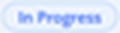 .
. -
You can format each value of the Status attribute or metric:
-
Select the Value to format.
-
If the status marks display as icons, choose a predefined icon from the Selection drop-down list. You can instead upload your own image by clicking Browse.
-
If the status marks display as tags, choose a tag from the Selection drop-down list. Choose the Text color, background Fill, and Border. Click Apply.
-
-
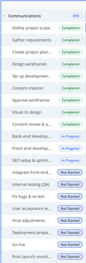
By default, the percentage complete displays on the group level, while the status marks display on the lower level. You can hide the percentage by clearing the Show Value on Group Bars check box.
In the image below, the statuses are shown as tags and the percentage displays on the group.
Dependencies are lines connecting tasks to show which activities must be completed before others can start. This area is available when the Dependencies drop zone contains an object.
-
Display: By default, the dependency lines are Always displayed on the chart, but you can change it to display On Hover/Selected.
-
From Task (Predecessor): Select the object to use as the predecessor task.
-
To Task (Successor): Select the object to use as the successor task.
-
Type: Determine the direction and location of the lines connecting the dependencies.
Click here to view descriptions and examples of each type.-
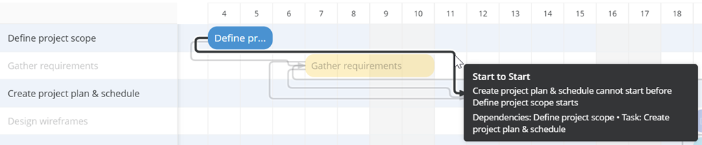
Start to Start: Successor task cannot start before the predecessor task starts. The connecting line originates at the start of the predecessor task and ends with an arrow at the start of the successor task.
-
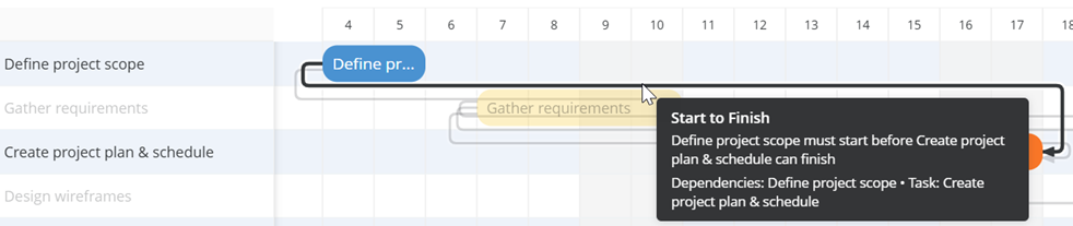
Start to Finish: Predecessor task must start before the successor task can finish. The connecting line originates at the start of the predecessor task and ends with an arrow at the end of the successor task.
-
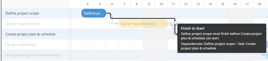
Finish to Start: Predecessor task must finish before the successor task can start. The connecting line originates at the end of the predecessor task and ends with an arrow at the start of the successor task.
-
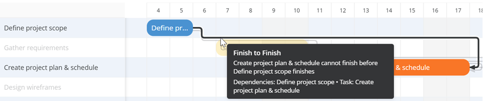
Finish to Finish: Successor task cannot end before the predecessor task ends.The connecting line originates at the end of the predecessor task and ends with an arrow at the end of the successor task.
-
Reference Lines A reference line is a vertical line displayed on the timeline to represent a specific date, such as a milestone or major deadline. Use them to help your team quickly understand where the project stands relative to critical dates.
-
To add a reference line, click Add (the plus icon), and select Today or select a Custom Date.
-
To format a reference line, in its area in the Reference Lines section:
-
Select the style and color of the reference line from the Type drop-down lists.
-
Enable Line Label to display a label (name) on the reference line.
-
Select whether to display the Type (Today or Custom Date) or the actual Value (such as May 4, 2026) for the label.
-
Format the reference label in Reference Lines on the Text and Form tab.
-
-
To rename a reference line, double-click its name in the Format panel and type its new name.
-
To hide a reference line, clear its check box.
-
To delete a reference line, click the Remove icon
 next to its name.
Thresholds Use thresholds to highlight bars when data fulfills a specific condition.
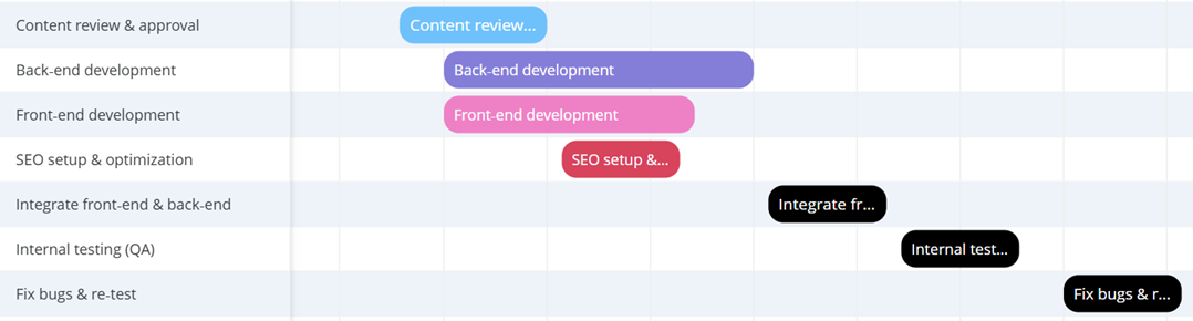
The timeline displays task names in the bars. Create a threshold to highlight tasks that have not been started in black, as shown below. This allows you to still read the task names in the bars.
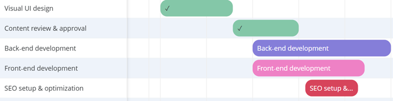
You do not want to be distracted by the names of completed tasks, so you create a threshold to replace them with check marks on green bars, as shown below:
-
To add a threshold based on objects in the dataset, click Add (the plus icon), click Based On, and select an object. This initial list displays only the objects in the visualization.
-
To base the threshold on an object in the dataset but not on the visualization, select an object. In the New Condition window, from the Based On drop-down list, select the object. This list displays all the objects in the dashboard's visualizations.
-
Create the filter condition by defining a list of attribute elements to include or exclude or creating a qualification on an attribute or metric value.
-
Click OK.
-
-
To add a predefined threshold, click Add (the plus icon), click Predefined, and select the definition:
-
Starting Tomorrow
-
Approaching Deadline
-
Missed Deadline
-
-
To format a threshold, in its area in the Thresholds section:
-
Select the Color of the bars that meet the threshold.
-
If the attribute used in the threshold filter is included in the Label drop zone on the Editor panel, you can Enable Data Replace to replace the attribute text displayed on the bars. If you select the check box, select one of the following:
-
Text, then type the replacement text in the Value box.
-
Symbol, then select the Symbol to display from the drop-down list.
-
-
-
To rename a threshold, double-click its name in the Format panel and type its new name.
-
To change the order that thresholds are applied, click the Move Threshold Up icon or Move Threshold Down icon next to the threshold name. Once a task meets a threshold, its formatting is applied and the task is not evaluated against any subsequent thresholds.
-
To hide a threshold, clear its check box.
-
To delete a threshold, click the Remove icon
next to its name.
Text and Form
Format the font for text displayed in different areas of the chart.
Select the area to format:
-
Task & Row Labels
-
Axis Labels (Display or hide axis labels in Axes on the Visualization Options tab.)
-
Bar Data Labels
-
Reference Line Labels If reference lines are defined, this option is available. (Enable and define reference lines in Reference Lines on the Visualization Options tab.)
Container
Format the visualization’s title and container (think of the container as the object that holds the visualization).
Title Bar
You can enable or disable the Title Bar.
-
When it is enabled, you can Customize the Visualization's Title Bar by selecting the fill color, font options, whether to display one or two lines, and personalize action buttons.
Container
-
Fill: Select the background color of the visualization from the palette.
-
Border: Select the style and color of the visualization's borders from the drop-down lists.
-
Adjust the Radius of rounded corners for the container.
-
Use a number between 0 and 40.
-