
Create a Gantt Chart Visualization
Beginning in Strategy One (July 2026), you can create a Gantt chart visualization to generate a project schedule. A Gantt chart maps tasks along a timeline to illustrate the project schedule. Use them to:
-
Assess how long a project will take
-
Assign the resources needed
-
Manage dependencies between tasks
-
Diagnose scheduling bottlenecks before they delay the timeline
-
Identify your project's critical path--the longest sequence of tasks required to finish the project on time
-
Communicate all this information to your project's stakeholders in a easy to read and understand visualization
In the Gantt chart, specific tasks display as horizontal bars. The length of the bar indicates the task's planned duration, with starting and ending dates, as shown in the simple example below:
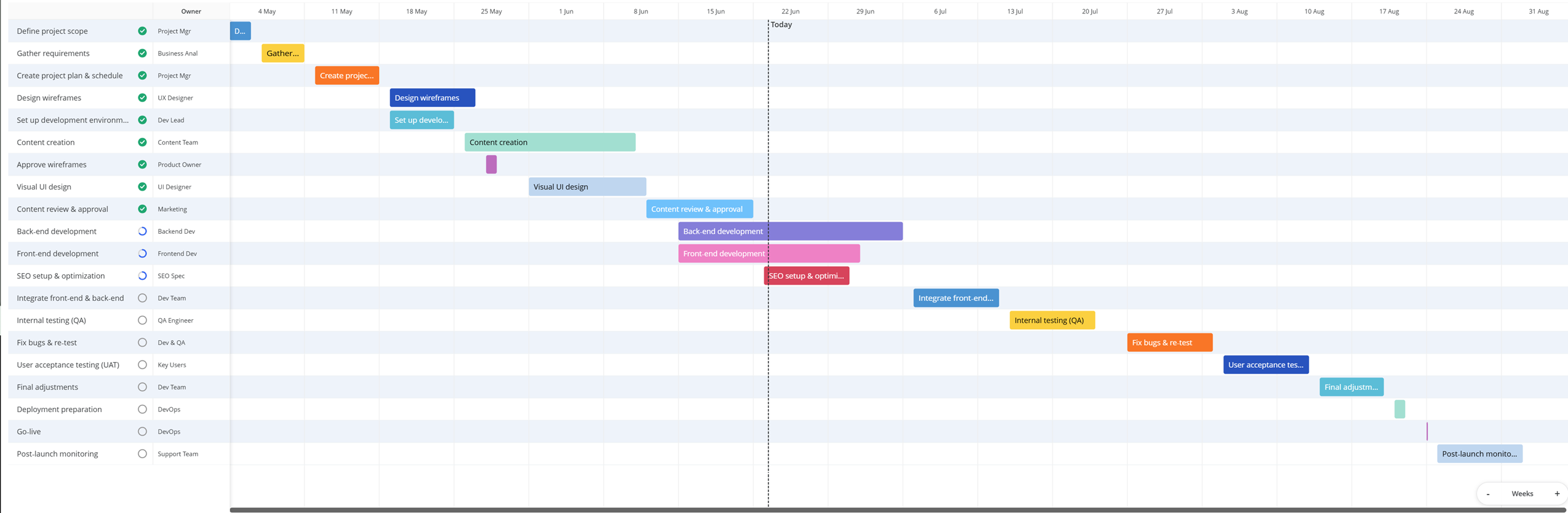
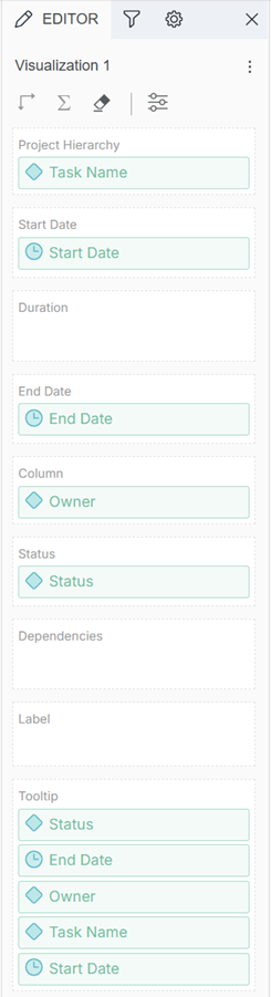
- At least one attribute to represent the projects, tasks, and/or activities to track. This is the Project Hierarchy in the Editor panel. In the example above, the task displays in the first column on the left.
-
The date range for the bars, specified using any two of the following:
- A date attribute representing the Start Date for each task
- A date attribute representing the End Date for each task
-
A metric representing the Duration of each task
In the example, start and end dates were provided in the dataset.
This Gantt chart example also includes:
-
Icons representing each task's Status displayed next to the task.
-
Additional information displayed in the Column. In this example, it's the team that owns each task.
-
A dotted reference line for today's date
Prerequisites
-
Gantt charts are best utilized when the sequence and duration of your project steps are known.
-
The dashboard contains a dataset with the required minimum information.
Create a Gantt Chart
- Open a dashboard.
-
In the top toolbar, click

- Point to More and click Gantt Chart
 .
. 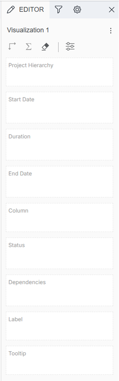
- The Project Hierarchy contains the attributes that represent the projects, tasks, and/or activities to track. Drag at least one attribute from the Datasets panel to the Project Hierarchy drop zone.
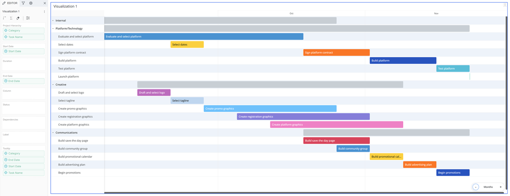
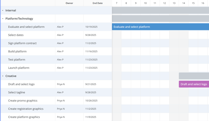
- If you add multiple attributes, add them in the proper order (or rearrange them) to create the correct hierarchy. For example, add Category first then Task, as shown in the example below. You can collapse and expand each level; the image shows the Internal category collapsed. The lowest-level attribute is shown as colored bars; parent attributes are gray bars.
- If you add multiple attributes, add them in the proper order (or rearrange them) to create the correct hierarchy. For example, add Category first then Task, as shown in the example below. You can collapse and expand each level; the image shows the Internal category collapsed. The lowest-level attribute is shown as colored bars; parent attributes are gray bars.
- Specify the date range for the bars. Use two of the following:
- Drag a date attribute representing the start date to the Start Date drop zone.
- Drag a date attribute representing the end date to the End Date drop zone.
Drag a metric representing the number of days for the tasks to the Duration drop zone.
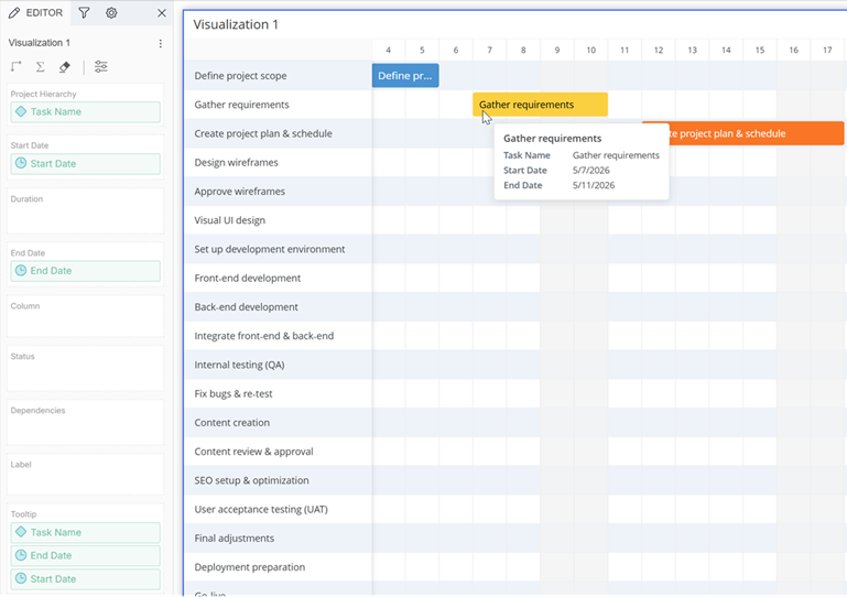
This completes a simple Gantt chart with the minimum requirements of a task and a date range.
-
Every object added to the Editor panel (except for the Label and Dependencies drop zones) automatically displays in the tooltip.
-
Remove objects from the Tooltip drop zone so they do not display.
-
Drag objects (metrics or attributes) to the Tooltip drop zone to add them to the tooltip.
Add more objects
Continue adding objects to the other drop zones to provide more details and information. These steps are optional. -
-
To display information in columns after the task names, drag attributes and metrics to the Column drop zone. For example, you can display an approver, manager, or owner (as in the initial example). You can display the owner and the end date.
-
Objects added to the columns automatically display in the tooltip. You can remove them from the Tooltip drop zone if you do not want them to display.
-
-
To display status information, drag a single attribute or metric to the Status drop zone. The status displays next to each task.
-
The attribute must contain status information such as "In Progress" for each task; the metric must contain the percent of completion for each task.
-
You can display the statuses as icons or tags and also format each status value independently. For example, the Not Started status displays as an open gray circle icon
 by default, but you can change it to a red circle icon, as shown below.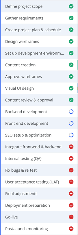
-
If you disable Status Marks on the Format panel, the statuses do not display.
-
Objects added to the status automatically display in the tooltip. You can remove them from the Tooltip drop zone if you do not want them to display.
-
-
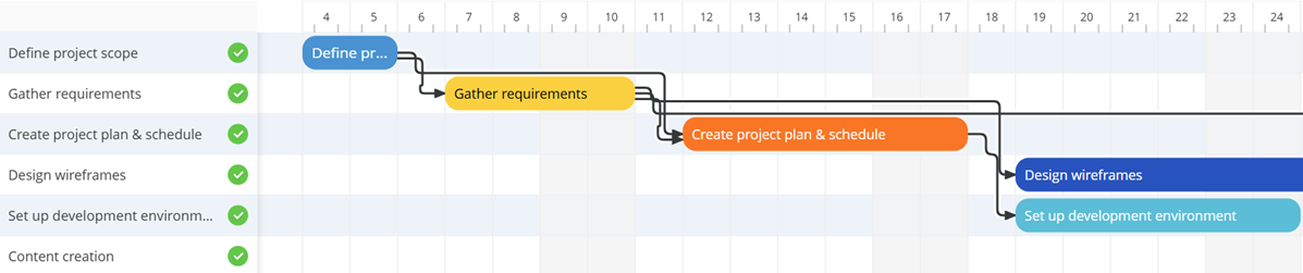
To display lines connecting tasks to show which activities must be completed before others can start, drag a single attribute representing the dependencies to the Dependencies drop zone. You can define how the connecting lines display in the Format panel.
-
By default, the lowest level attribute in the Project Hierarchy displays on the bars. In the examples above, that is the Task Name. To display a different attribute:
-
Drag an attribute to the Label drop zone. If you drag multiple attributes, they display in a comma-separated list.
-
Click Format
 to open the Format panel.
 -
On the Format panel, click Visualization Options
. -
Expand the Data Labels area.
-
From the Value drop-down list, select Label. In the example below, the label uses the Status attribute.

-
For additional formatting options, see Format Panel for Gantt Chart Visualizations: Data Labels.
-
Objects added to the label automatically display in the tooltip. You can remove them from the Tooltip drop zone if you do not want them to display.
-
-
Open the Format panel to select formatting options, both specific to Gantt charts and generic visualization formatting. For example, you can select whether to display weekends in the timeline, add reference lines and thresholds, and display the visualization title bar.
- Save the dashboard.